The formula is same here. Pack the offering with compelling hardware options and consolidate a big battery. On paper, you will find the different models identical with minor changes here and there, but the devil is in details. Yes, I’m talking about the software experience on Samsung and Xiaomi phones. Samsung’s One UI and Xiaomi’ MIUI are among the heaviest modified versions of Android. In this post, we will point out the major differences between those custom skins, so that you can make your purchase decision based on that.
User Interface
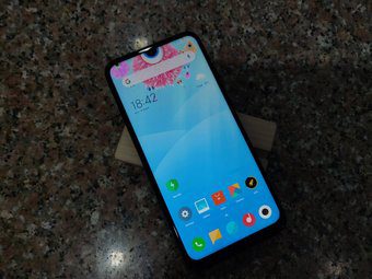
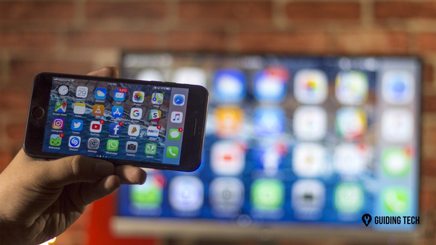
Both the launchers have their philosophy around the UI. And unsurprisingly, they are far from Google’s material design guidelines. Starting with Samsung, the company has completely overhauled the look and feel of Samsung experience with One UI. They come bearing rounded corners in every section, which perfectly rhythms with curved corners of the device. The icons, Settings menu, notification bar, and Samsung apps have adopted rounded UI, which sure looks nice. You will find consistency and acknowledge just how thoughtful Samsung has been while designing the UI. For example, all Samsung apps have adopted bottom bar tabs and display a big banner on top. The upper part of the app is always accessible, which is boon on tall smartphones. With MIUI, Xiaomi has tried to strike a balance. The UI is minimal, but it closely resembles iOS. There is no app drawer, the share menu, and notification panel are straight from Apple’s design book.
Customization Options
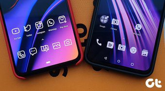
Both the launchers let you change every piece of UI with various options. With MIUI, you can play with transition effects, home screen layout, icon layout, and even implement a new icon pack from the Play Store. Xiaomi offers a dedicated theme store to change the wallpaper, system accent, icons, fonts, and overall look. There is something for everyone. Samsung isn’t far behind either. One UI lets you change Home screen grid, app layout, notification toggles, remap Bixby button, icon badges, and more. I found Samsung’s theme store better than MIUI. Not only it tweaks wallpaper, device theme, and icons but also lets you customize AoD (Always on Display). It’s obvious that none of them offers Nova like functions, but that’s the story of another day.
Features
One of the advantages of using an OEM skin over stock Android is the number of functions you get by default. With One UI, you can implement system-wide dark mode, use a blue filter for night reading, and record screen. Samsung’s curved edges also let you access the Edge panel. With that, you can access favorite apps, contacts, utilities, and app widgets with a swipe. Samsung has implemented a productivity tool called secure folder. You can securely hide apps, images, and documents in it. One can use normal social apps on the phone and use the same apps with a different account on a secure folder. Xiaomi’s MIUI has added reading mode, dark mode, an app vault for hiding apps, the ability to lock apps with biometrics, scrolling screenshots, and much more. The company also offers AoD, but it’s limited to a handful of devices, and the customization options are far from One UI.
Gestures
Both Samsung and Xiaomi have their take on Android’s messed up gestures. Also, both come with a challenge of overwhelming UI in the first place. Thankfully, gestures are the saving grace. Swipe up to go home, swipe up and hold to access multitasking menu, and swipe from either of side screen to go back. It works fine, but the animations aren’t consistent. I often found lag on lower-powered devices. Samsung’s take is straightforward. It will display navigation indicators where you swipe right for multitasking, and swipe left on the indicator to go back. Then, swipe up from middle for the home screen.
My Feed
Samsung and Xiaomi have replaced the traditional Google Now feed with their implementation. On Galaxy devices, swipe left, and you are treated with a personalized Bixby Home. It displays frequently used apps, contacts, Bixby Routines, News, app widgets, and more. Xiaomi’s take is similar too. It shows profile, weather, most used apps and contacts, smart actions from built-in apps, Cricket widget, and more. I prefer these solutions compared to a standard Google Now feed. Google has started showing ads in feed UI, and it’s more about news clicks than meaningful information.
MIUI or One UI?
As you see from the above list, both launchers are packed with various customization options and features. I prefer Samsung’s solution as it’s more consistent and smooth across the UI. Next Up: OnePlus Oxygen OS is known for it’s clean take on Android. Read the comparison below to see how it fares against Samsung One UI. The above article may contain affiliate links which help support Guiding Tech. However, it does not affect our editorial integrity. The content remains unbiased and authentic.


