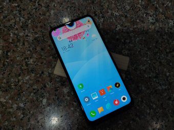
Based on your personal preference, the software experience can make or break the purchase decision for you. Xiaomi is going with MIUI while OnePlus has integrated Oxygen OS on top of Android. And boy do they differ in their UI, gestures and animations. Using them side by side made me realize just how different their approach has been to Android. In this post, I’ll point out the major differences between the two and help you see which one might suit better for your needs.
User Interface
Here is where both MIUI and Oxygen OS take a different route. While MIUI has opted to change every possible design element, OnePlus has stuck to Google’s guidelines for the most part. With MIUI, you can see how closely it resembles the iOS interface. The transparent notification menu, share menu, settings, etc are straight out of Apple’s book. I like it, but on iOS, not on Android. Sorry, Xiaomi. OnePlus’s Oxygen OS has mostly followed the Material design, which is nice to see. OnePlus has made some changes to certain areas though. The settings menu look different. Overall, I like OnePlus’s approach here. I feel Xiaomi is making changes just to look different from others. One thing to note: I often found ads in Xiaomi’s built-in apps. The service keeps pushing notifications from built-in apps.
Customization Options
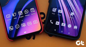
Xiaomi lets you change every possible detail of the interface with added options. You can play with transition effect, home-screen layout, icon shape, and layout. Xiaomi also offers a dedicated theme store. With that, you can implement matching wallpaper, icons, theme, and fonts to the UI. It gives that personal touch to the device. OnePlus’s approach is straightforward. It lets you change the home-screen layout, add third-party icon packs, notification dots, and gestures. OnePlus won’t offer a dedicated theme store but it does allow you to switch to a dark theme. The company has integrated various accent colors which switches notification toggles and buttons to your favorite color. I like that, it’s a refreshing touch over the boring blue.
Gestures and Multitasking
As expected, both MIUI and Oxygen OS offer full-screen gestures similar to iOS. OnePlus offers three options. A standard three-button navigation, an implementation similar to Google’s approach with two buttons and full-screen gestures. Oxygen OS displays the multitasking cards in full screen, meaning you will only be able to see a single card at a time. Here I found Xiaomi’s solution better. It shows the opened apps in a vertical scroll menu. You can see more information at a glance here. Xiaomi’s full display gestures are also more polished than OnePlus. The gestures follow fingers and it feels natural. Swipe on either of sides of the screen to go back, which is more thoughtful than other OEMs.
Features
Both the launchers offer various add-ons over the boring stock Android. Oxygen OS has integrated App locker, Gaming mode, Parallel apps, different display mode, screen recorder, scrolling screenshots and more. My favorite one is Reading mode. When switched on, the display tunes to black and white theme which is useful for reading at night. Xiaomi’s MIUI has added reading mode, dark mode, an app vault for hiding apps, the ability to lock apps with biometrics, scrolling screenshots, and much more. The company also offers AoD, but it’s limited to a handful of devices.
My Feed
Both the launchers have replaced the traditional Google Now feed with their version. Xiaomi’s feed UI shows profile pictures, weather, calendar, and other basic info. You can quickly access the built-in apps shortcuts from the panel. Xiaomi has also implemented Cricket widget, news integration, and you can add widgets from the installed apps. OnePlus’s take is known as Shelf. It is similar to Xiaomi but better in every way. For starters, the UI is nice and clean. It won’t load up the data every time you swipe left. You can access frequently used apps, contacts, quick triggers, and add app widgets. I like this approach more than Google Now. Google Feed is showing ads and the suggested news articles from Google AI are hit and miss for me. I prefer having all the apps widgets in a vertical scroll UI.
Which One Should You Use
As you can see from the above list, both the launchers differ in various aspects and have strength and weaknesses in certain areas. My preference is Oxygen OS because it gives a cleaner, minimal look that’s close to the stock Android experience. MIUI is good for people who want a customized look and if you’re one of them then sure, go with MIUI. Next Up: Samsung has shaken up the Android experience with the One UI. Read the post below to see how it fares against Xiaomi’s MIUI. The above article may contain affiliate links which help support Guiding Tech. However, it does not affect our editorial integrity. The content remains unbiased and authentic.


![]()


