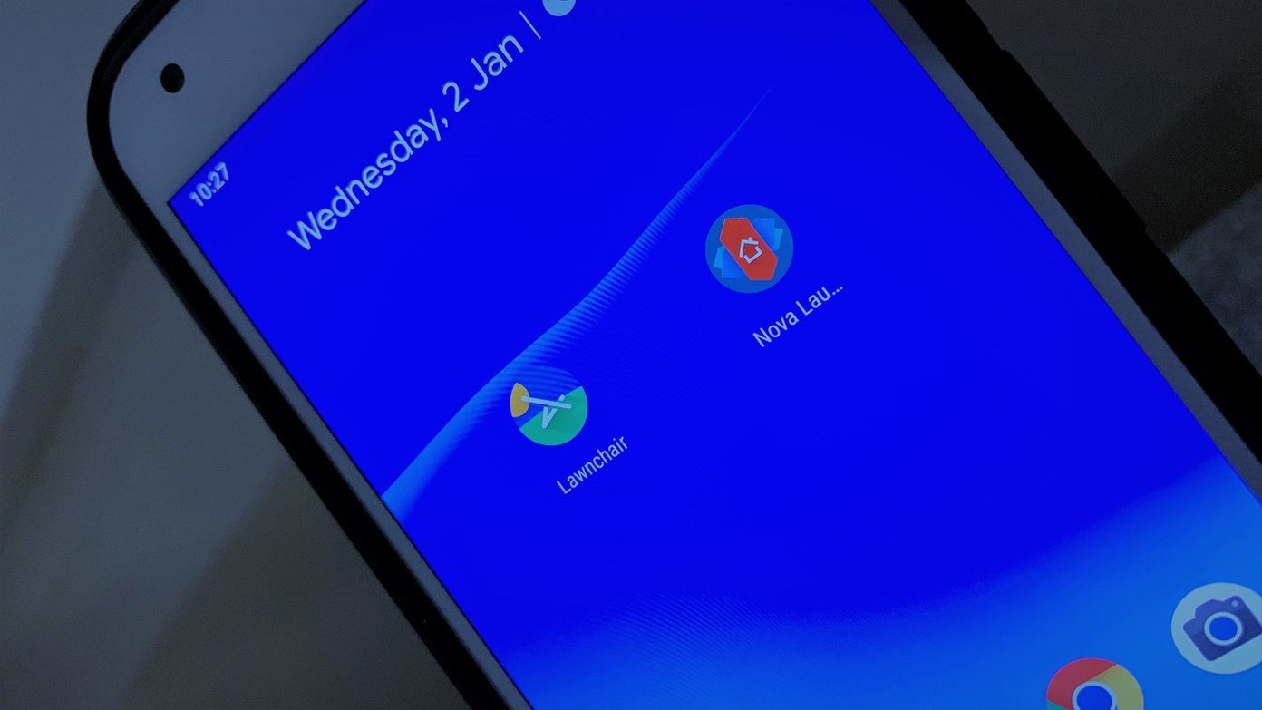
Nova launcher is one of the most popular Android launchers that comes loaded with features. Pixel Launcher, on the other hand, is the default launcher for all Pixel devices and offers a clean stock Android experience. Let’s compare both the Android launchers and see how they fare in terms of features.
Customization Options
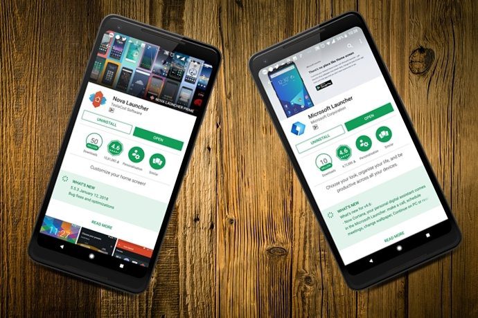
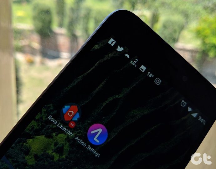
Nova Launcher is best known for its customization options. It lets you change the user interface visually as well as functionally. The free version of the Nova Launcher offers a large number of features, including the ability to control the positioning of each icon on your home screen. You can change everything from color themes to icon packs, scroll-able docks to app drawer customization, and even folder settings. It supports dock customization, notification badges, an option to show frequently-used apps in the top row of the app drawer, and folder and icon customization. A popular feature of the Nova Launcher is the infinite scrolling that lets you scroll seamlessly between the home screen and the app drawer. You can also control the animation speed, app animations, and gestures. On the other hand, the Pixel Launcher is an upgrade to the previous Google Now launcher. It’s a low-maintenance launcher, which does not come with a lot of bells and whistles. It retains Android’s iconic app drawer, folders, and app shortcuts. One of the main additions to the Pixel Launcher is the At a Glance Widget that shows your next appointment, time, and weather. You can also change the shapes of the icons. The Pixel Launcher also offers app suggestions at the top of the app drawer and you can also turn them off if you wish.
Ease of Use
Nova Launcher lets you set your home screen as per your choice and still manages to work smoothly. It doesn’t lag even after adding lot of widgets. Nova Launcher is a relatively old app but it’s fast in getting updates and also quick in fixing bugs. It offers the ability to back up and restore your home screen layouts for when you eventually switch to a new phone. On the other hand, the Pixel Launcher is pretty simple to use. It feels intuitive and helps you to navigate more easily. You can access Google Search quickly and navigate to apps with a simple swipe-up gesture from the Favorites row at the bottom.
Looks and Design
Both the launchers score high when it comes to looks and overall design. The launchers have a clean UI that is easier on your eyes. The Nova Launcher offers a near-stock Android experience in addition to the wide range of customization options. The Nova Launcher also offers light and dark themes but the Pixel Launcher doesn’t have a dedicated dark theme. The only way to get the dark theme on Pixel Launcher is by using a dark-colored wallpaper on the home screen. The app drawer switches from white to black once you change the wallpaper with the black elements. The white text only works well against dark wallpapers in comparison to the more transparent light ones.
Which is the One for You?
If you’re using the Nova Launcher for the first time, it can be a little intimidating as it lets you change each and every aspect of your phone’s look. At the end of the day, it depends on what you need from a launcher. As for me, I am content with the Pixel Launcher for now. Which Android launcher do you prefer? Let us know in comments. The above article may contain affiliate links which help support Guiding Tech. However, it does not affect our editorial integrity. The content remains unbiased and authentic.
![]()


![]()
![]()


![]()




![]()
